
Solutions Sneak Peak
Overview
As a team we were tasked to improve an eCommerce website’s usability to generate more online sales.
Duration: Two Week sprint
Type: Responsive design for web & mobile
Members: Elvis Bayley, Fiona McBean, May Wu, Sue Liu
Role: Research, Ideation and Product Designer
Methods: User Interviews, User Surveys, Competitive Analysis, User Flows, Wireframe, Usability Testing, Prototyping
Tools: Figma, Google Forms, Zoom and sticky notes
The Challenge
Many travellers spend anywhere from 1-3 weeks making a purchase decision on their airfare, searching and revisiting the Expedia website for the best flight option that meets their preferences. More than 70% of travellers can be identified as Informed Consumers when making flight purchase decisions. For travellers to collect flight information, they need to repetitively enter the same flight details and preferences to review their options.
Project Objective
Our goal is to empower travellers to purchase flights in the quickest and most efficient way. How might we implement an informative and transparent purchase experience for travellers to feel confident in their flight purchase without leaving Expedia?
My Contribution
In this project, my role was similar to a Creative Director/Researcher. My contributions consisted of collecting user data and leading the creative portion of a project. I was able to add value to the project by coming up with ideas, thinking of possibilities and setting the direction for our design solutions. I worked creatively with the project team by providing input and reviews on their work, ensuring we maintained the creative vision while keeping the user’s needs top of mind.
The Opportunity
People primarily depend on web and mobile platforms to search and purchase their airfare. However, the experience has not deviated from people trying to make sense of a large amount of information to decipher which option meets their needs. Which often results in people taking days to weeks to make a purchase decision. This behaviour has motivated me to explore ways to enhance their experience to make confident purchase decisions.

Discovery Phase
We want to understand the users' behaviours on the Expedia website while searching for fare and discover the user's preferred experience when making a purchase decision so that we can improve and help users achieve their online shopping goals.
Research Objectives
To identify the current market for online travel companies.
To learn about current behaviours and browsing habits of users when interacting with online travels sites
To understand user's goals, values, needs, and pain points when interacting with online travel sites
To learn what features contribute to a good experience for users when online making purchase decisions
To validate/invalidate assumptions about user experiences with online travel sites
Assumptions/Hypothesis
I believe that travellers procrastinate to make a purchase because they are not able to adequately review their options.
I believe there is an extensive clickstream for users during their search and consumes their decision-making abilities.
Research
Interviews
8
Interviewees
60
Minutes Per Session
Conducted 8 user interviews to see what potential problems there are in the online travel booking space. We discovered 3 things that were common among users.
1. Needs to compare/research flights before making a purchase.
2. Often frustrated by prolonged search forms and confusing filters.
3. They need to better understand fees and add-ons before making a purchase.
Surveys
48
Responses
65%
Ages 25-35
Designed a survey to validate the three hypotheses gained from qualitative research are statistically significant. We received 48 responses that gave us helpful insight on user behaviour patterns.
(Click to enlarge)
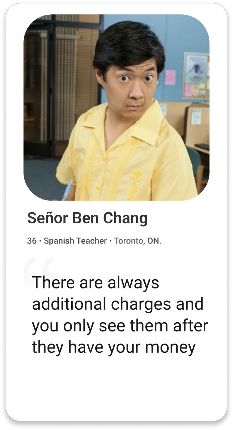
“A function comparing each airline’s policy on cancellation or change fees would be a useful tool to choose between potential flights. If anything goes wrong after booking, it can be very hectic to find a solution. Thus, I sometimes end up booking on Airline websites instead, like aircanada.com”
— User Survey
Revealing Users’ Pain Points


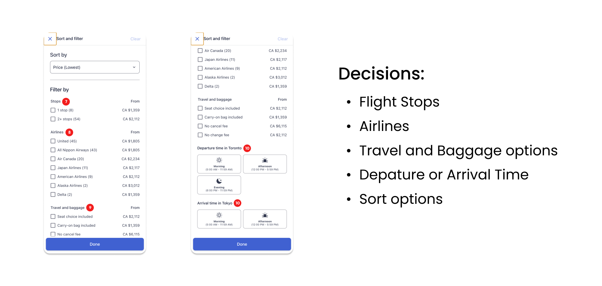
14 Decisions to review one flight option

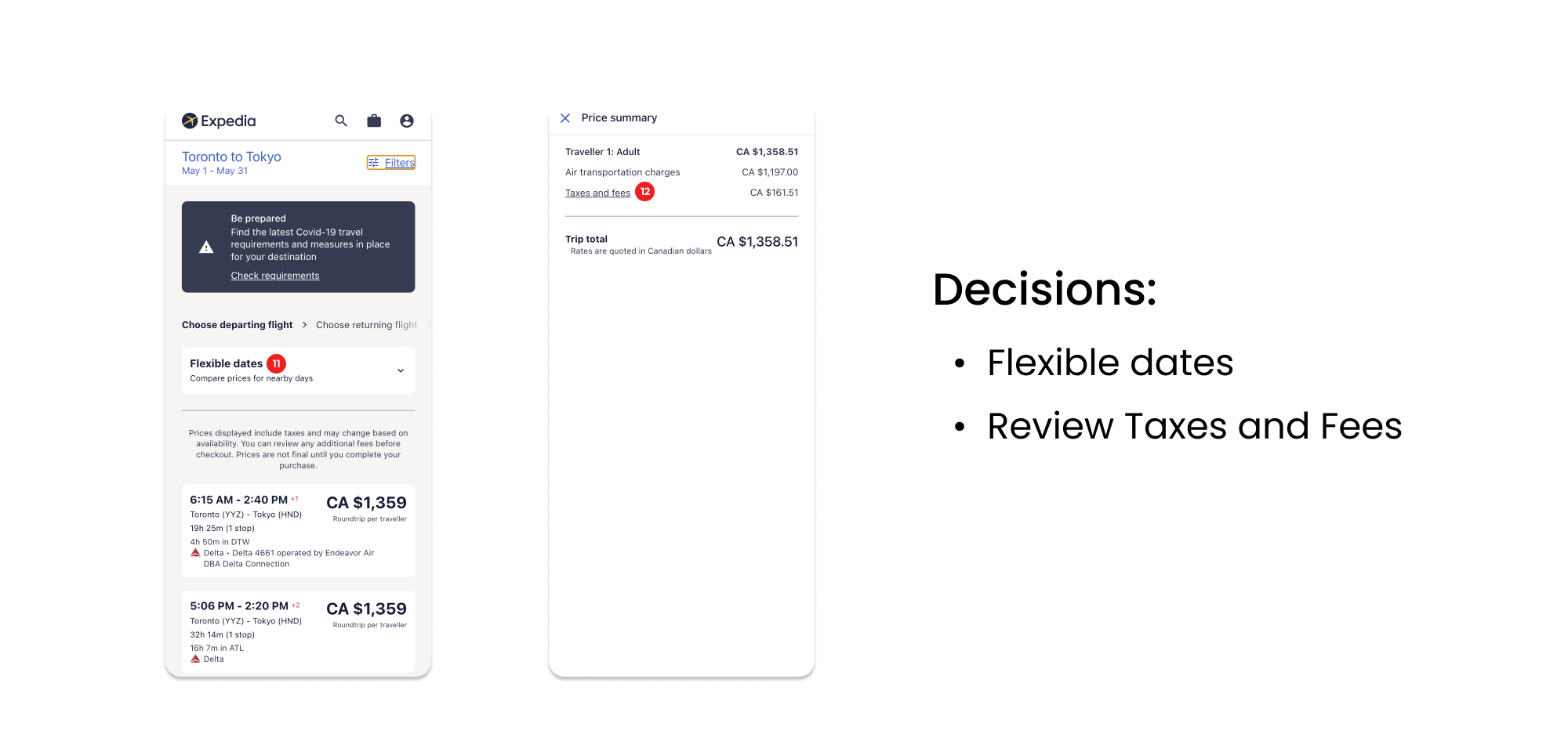


Competitor’s Compare Tool
Research revealed, currently, Expedia does not allow users to compare different flights effectively. Kayak, however, has a compare window it lines up FlightHub and eDreams in a side-by-side view to facilitate flight comparison.
User Journey
I created Ben’s journey as a visualization of the user’s relationship with a product, which also allowed me to see a product from the user’s point of view. This document was shared with my team to help them understand all of the touch points that would bring the customer to the website, the current site problems with ideas on how to improve the experience.
A few insights emerged from this exercise:
Needs to quickly resume his research where he last left off.
He needs to research the best option right for him but can get overwhelmed easily because it's time consuming and information heavy.
He needs to compare his flight options effectively to make a purchase.
Humanizing the Research
Based on the result of the user research, we realized that most of our target users have common needs and desires.
Preference
Typically traveling alone
Collects Expedia points
Price and value driven
Non-spontaneous traveler
Scenario
Researches his vacations extensively.
Visits multiple travel sites
(i.e. Expedia, Kayak, Booking.com) to compare options.Visit these sites 2-3 times each within a week to make a decision.
Ben, who often visits 2-3 different travel sites to compare flights, needs a better way to see his options on Expedia, so that he can make a confident purchase without being overwhelmed.
Ideation
Concept Sketching
Our team had a Design Studio session to generate many ideas quickly. The session was completed in an hour where we individually sketched ideas first and integrated on the initial concepts.
Wireframes in Figma
I started creating wireframes keeping in mind style guide of different pages so that the user are able to navigate with ease. The whole website is rich in imagery keeping the website vibrant, even though the content is text-heavy.
User Testing
With user testing, I wanted to know if this feature would meet user's need in finding the best option for value. I conducted in person user testings where I asked users to interact directly with the prototype, and asked them questions about their experience afterwards.
Feedback from Users
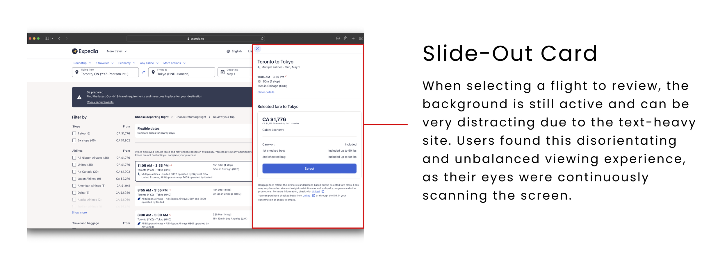
Comparison page was not showing users the complete picture.
It's cumbersome for users to scroll left and right to compare flights.
Users would like to see better price breakdowns to understand added fees.
Our Solution!
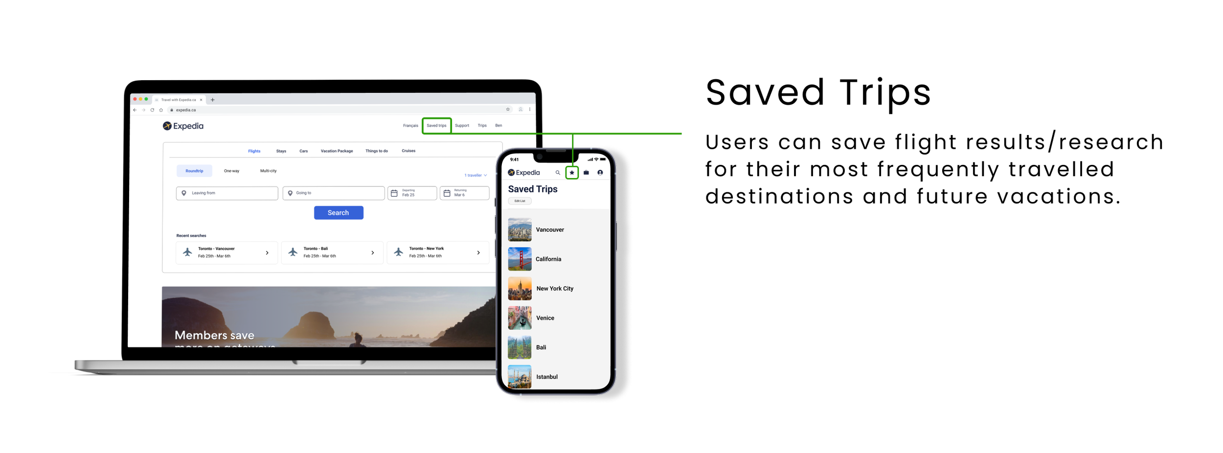
Flight Preferences
Users can save their flight preferences within their profile, to reduce repetitive entries.
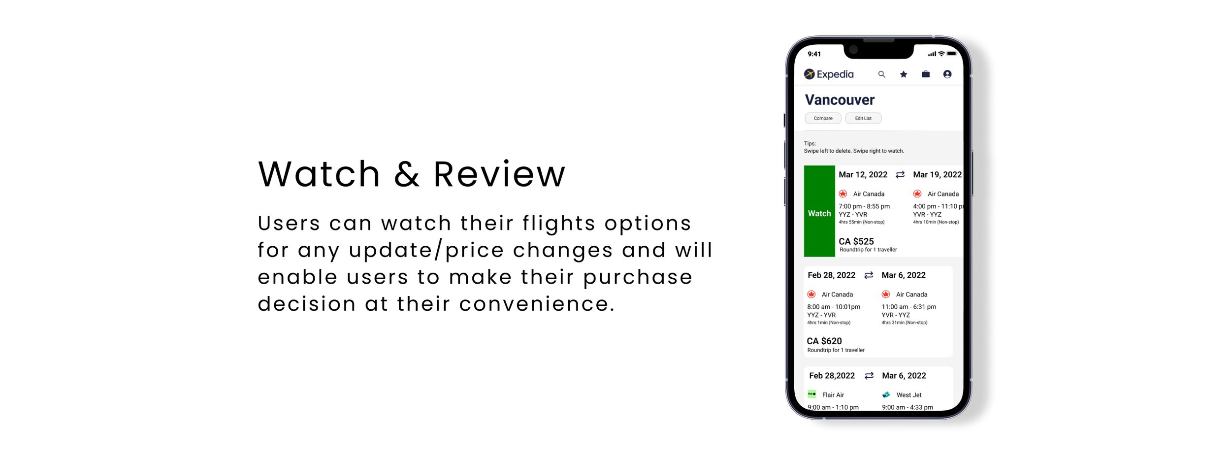
Watch & Review
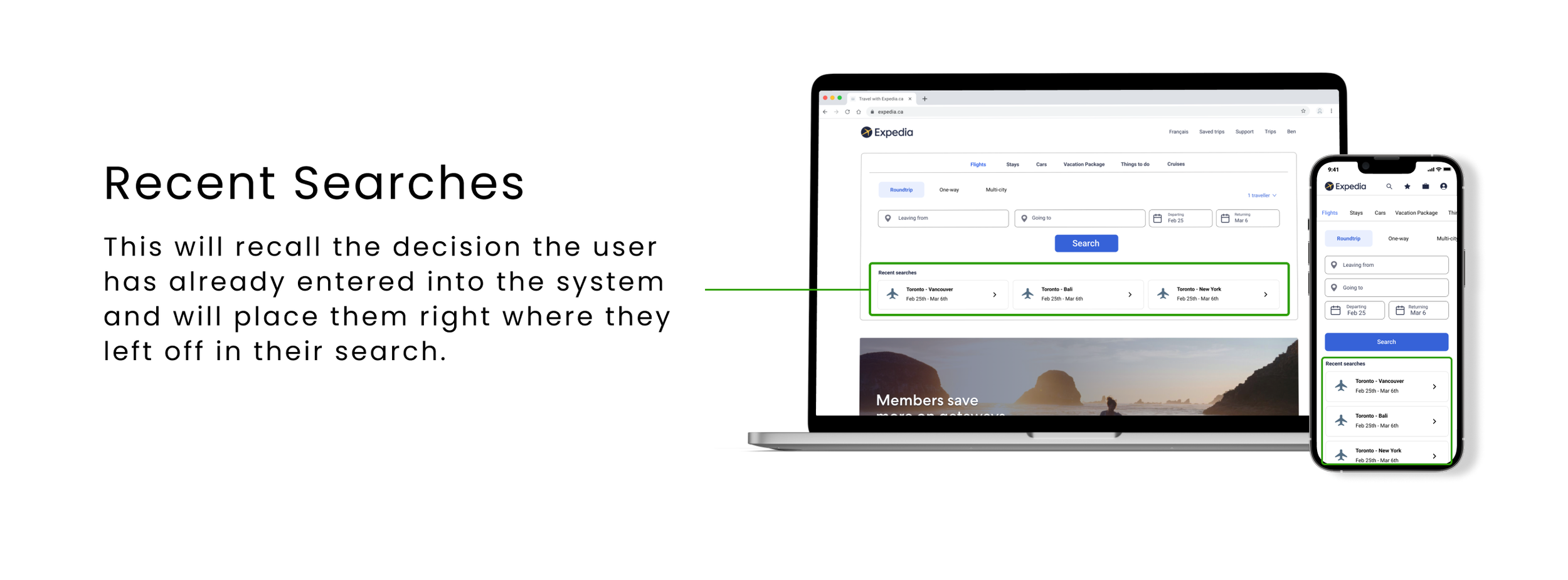
Users can watch their flights options for any update/price changes and will enable users to make their purchase decision at their convenience.
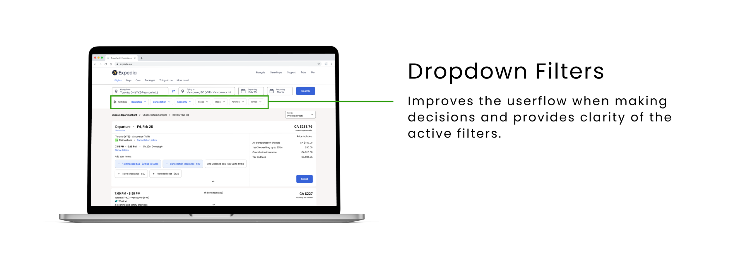
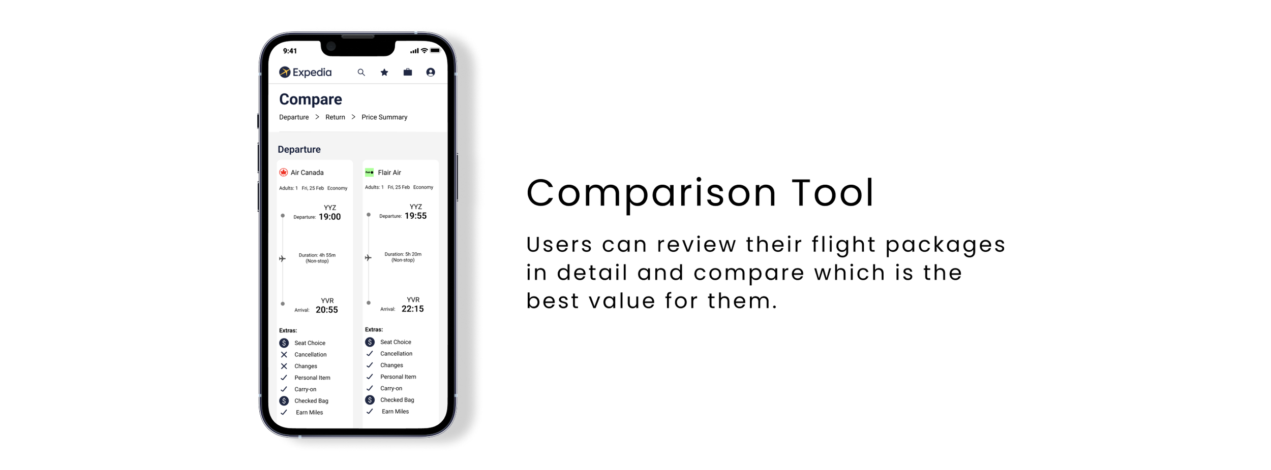
Comparison Tool
Users can review their flight packages in detail and compare which is the best value for them.
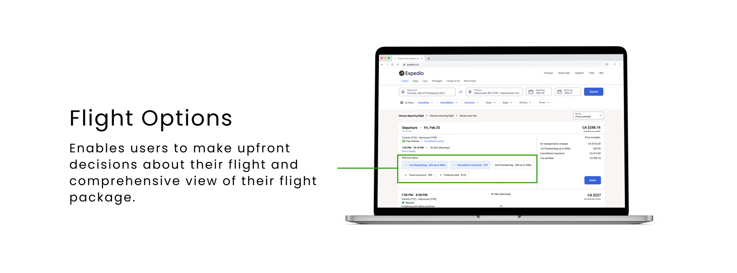
Flight Options
Enables users to make upfront decisions about their flight and comprehensive view of their flight package.
Key Takeaways
This was my first collaborative project as a UX Designer on an e-commerce website. Upon reflection I realized there are some things I could have done differently:
1. User Knows Best! - The biggest takeaway from this entire project was to let the research speak for itself and how important it is as the foundation of your solutions. A fair bit of time was spent going back and forth with teammates defending decisions, as opposed to testing our hypothesis and collecting more data to validate them.
2. More to Discover - I would have liked to continue with extensive research on some of our redesign hypotheses. What felt was missing from the Expedia experience was transparency for the users, I wanted to further unravel ways we can empower their decisions and earn their trust.
3. Before and After - Lastly, I would have also liked to see the results from A/B test based on the current model vs the redesign. I wanted to make revisions to the wireframes, but they were left on the cutting room floor due to scope creep and meeting project deadlines.