Overview
Duration: Two Weeks
Type: Mobile App
Role: Research , Product Design
Methods: User Interviews, User Surveys, Competitive Analysis, User Flow, Wireframe, Usability Testing, Prototyping
Tools: Figma, Google Forms, Whimsical, Zoom
I was given two weeks to create a new feature on a stock Android application to optimize tasks.
Problem
Users do their best to organize their emails throughout the day but have difficulties prioritizing their actionable emails once new communications are received, leaving users overwhelmed and apprehensive from taking immediate action.
Solution
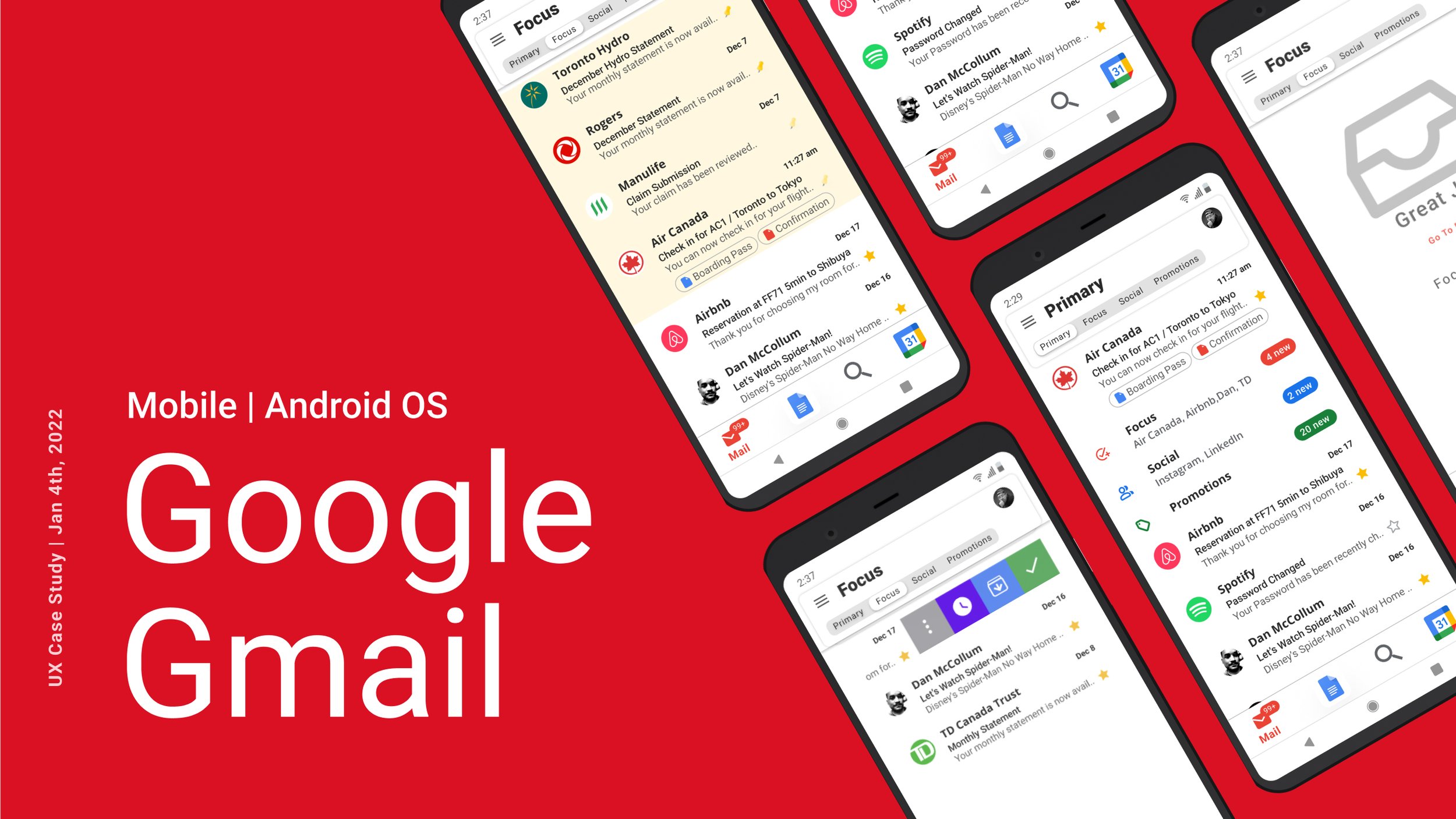
Features that allow users to have a dedicated space to focus on their most important emails, quick access to organization tools and empowering users to decide when is the appropriate time to be presented with information.
Design Challenge
How might we help users organize their emails easily to prioritize their tasks without presenting an overwhelming amount of information?
Solution Sneak Peak
Discovery Stage
The Competition
Professional Tools not available on personal accounts.
(Click to Enlarge)
10 User Interviews
I started the discovery phase by conducting 10 interviews to understand how users are using their Gmail App daily. Once the data was collected and analyzed, I was able to identify common behaviours and identify user pain-points. I released a survey to identify the existing challenges, habits and workarounds. There was a total of 28 anonymous participants in total, responding to questions such as:
How to do organize important items within the Gmail App?
Tell me about a time when you would need to use a third-party app?
Do you sort all the emails within your inbox to a folder?
What kind of frustrations to do you have when using the Gmail App?
28 Survey Responses
What Users Are Saying
“I get overwhelmed with the amount of information on the screen, it discourages me from starting tasks right away. It's like looking at a brochure and gets mentally draining.”
— Interview Participant
Research shows…
Despite 44% of users reporting that they feel like their Gmail email is organized. Over 70% of those users do not empty their inbox and spend additional time to search and scroll for important emails/documents.
60% of participants felt overwhelmed with the amount of information presented in their inbox when trying to complete certain task, user became apprehensive in taking immediate action.
68% reported using their Gmail app for personal and professional use, which will dictate what actions they will need to take within that week or month. 80% of participants use 3rd party apps to stay organized.
Work Arounds
Users have started to create alternative emails in an attempt to limit the amount communications/ distractions.
Use multiple apps simultaneously when responding or making future decisions.
Will send themselves emails as reminders or reference.
Users’ Biggest Pains..
User Persona
Synthesis
Upon discovering some key takeaways from the user data collected from 28 participants, I used the information to create a persona and journey map to understand the behaviours of typical users using their Gmail App. This was a crucial step in compiling my survey data into usable insights to finalized a list of features to resolve users’ pain points.
Meet Art Vandelay!
Demographics:
30 Years old
Married with children
Creative Professional
Travels for work daily
60 hour work week
Mindset:
Uses Email as a primary tool to communicate with clients
Needs clear, simple goals
Makes to-do list
Too many details are overwhelming
Journey Map
(Click to Enlarge)
Problem Statement
How might we support users in managing their inbox so they can easily prioritize and streamline tasks without presenting an overwhelming amount of information?
The Solution
Sketches
After my research & design thinking was completed, I started to utilize my interaction design skills and sketch a few wireframes of the new Gmail layout UI. I also used the paper prototype method to see how different buttons would look in the UI. Two major takeaways from the sketches were:
Having good visual representation in creating a separate space from the primary inbox.
Balancing the sizes of the additional buttons, so they do not obstruct the user's view and making sure they meet the accessibility requirements.
(Click to Enlarge)
Final Solution
View Switcher + Focus Mode
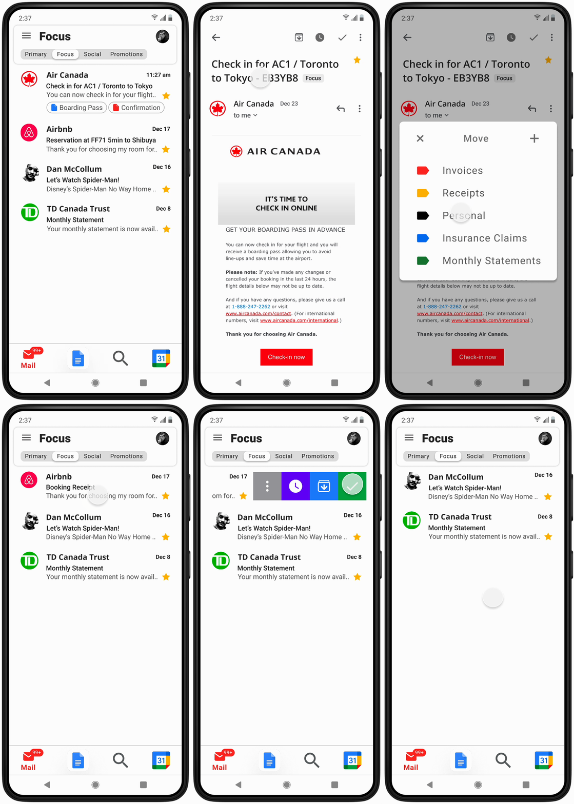
Users can toggle through each view and be presented with a dedicated view of the communication received. Once emails have been starred, they will be sent into the Focus Mode view so users can easily identify important emails with no distractions.
Star important emails
Creates a reference in Focus Mode
Take action!
Checkmark to Folder
Once a user decides that the email no longer requires any further action, users can then checkmark the email to indicate that it has been completed and decide to send it to a folder for future reference.
Select or swipe emails to organize
Press the check mark
Select folder destination
Swipe Gestures and Summary Page
The goal is to offer users quick access to some of the functionality of the Gmail app without having to navigate through the menu. The Summary Page will encourage productivity and highlight their accomplishments.
Swipe to organize your emails
Clear your Focus inbox
Review your accomplishments!
Enhanced Snooze and Pin to top
Users can snooze emails to temporarily remove them from the Focus view and will return on a selected date suitable for when the user needs the information. Selected or date-specific emails will be pinned to the top of the Focus view page for quick and easy access.
Hit Snooze button
Select desired date for email to reappear
Emails will become visible and pinned to top on date
Reflections
Good ideas with no direction - Initially, I had trouble framing the problem, I felt like I had to solve everything. It was only through our user survey that we were able to determine the most pressing problems encountered by the users. I had good ideas forming in the initial stages but I was able to collect real data that provided live insights and set my project direction on the right path.


